Tips for Creating Posters:
Posters are one of the most tried and proven pieces of marketing collateral. Posters are a great way to get the word out about your sales, events, and fundraisers.
While there is no one-size-fits-all approach to creating your piece of work, there are some guidelines to follow.
Determine the purpose .
You can utilize your major goals to guide your design decisions if you think about them from the start.
If your goal for your design is to persuade people to come to a conference, for example, your poster should be deliberately created to assist you achieve that goal. Simplicity always prevails in written communication, according to a common rule.
Choose where you’d like to distribute.
Before you begin the design process, you must first decide where you want your artwork to be shown. This is because, as you’ll see below, properly optimizing a design for print differs from correctly optimizing it for Twitter or Facebook.
Choose a colour palette that is both relevant and branded.
The colour scheme is likely to be one of the first things someone notices about your design. Most of the time, the right colour scheme will be clear. As a result, don’t overthink it! If you’re designing for a winter event, for example, a colour scheme of warm green, red, and white will conjure up images of the holidays.
Make use of high-resolution photographs and stock photographs.
If you’ve been paying attention to the templates and examples in this post, you’ve probably noticed how many photos are used. In the background, some people utilize a stock photo
Include a clear call-to-action in your message.
Once you’ve gotten someone’s attention, make it crystal obvious what their following steps are to assist them. This is referred to as a Call-To-Action (CTA).
A call to action (CTA) should be included on every page, regardless of topic or format. What is the point of making a design artin the first place if not to promote something?
Remove any extraneous parts.
When you’re working on a poster design, it’s tempting to get carried away. Step aside from your work area as you get closer to the final design to see if there are any design components that are simply extra. Remove them from your life.
Leave plenty of room This may go against design advice for other forms, but when it comes to design part, you need to go big on the spacing. Make sure your design has enough breathing room. It may seem counterintuitive to leave so much blank space, but it actually improves the visual impact and readability of your poster.
Take your audience on a journey with you.
Consider this: what do you want people to notice first? Working on your visual hierarchy and getting a second perspective on what people perceive first, second, and last while looking at your work is a good idea. This is significant since it will influence the effectiveness of your design.
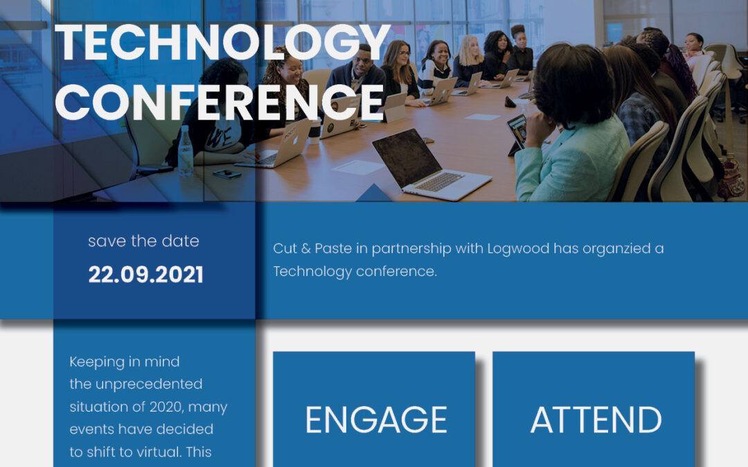
Free template for you
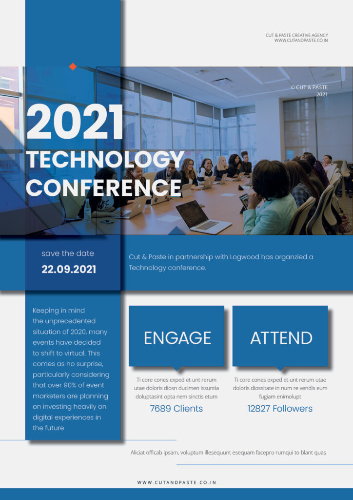
Here’s a free template for you which you can download and use
If you’ve learned the fundamentals, don’t be afraid to break the rules. Poster design is all about creativity, fresh points of view, and new perspectives. A successful poster design is one that alters someone’s perspective and makes them look twice at your work.
Keep things simple, don’t clog up design elements, and put your idea into action with less complicated methods. It should be a lot of fun to design the poster. Enjoy! the process of creating and share some of your results with us.
If you’re interested in learning a crash course on Poster Design or Graphic Design, we offer Live One to One classes.
Read more..
- Can Kashmir Become India’s Next Creative Hub?
- Partnered with Pulse 365 Inc., Canada
- photography editing course in kashmir
- Why Now Is the Best Time to Build a Creative Tech Career in India
- AI Integration with Design: Revolutionizing Digital Experience
A Multimedia Professional with an experience of over 17 years in the industry, Irfan is an Entrepreneur. He provides Digital Marketing Services to Brands & Startups and is one of the finest instructors in the Kashmir Valley who teaches Graphic design and Video Production.